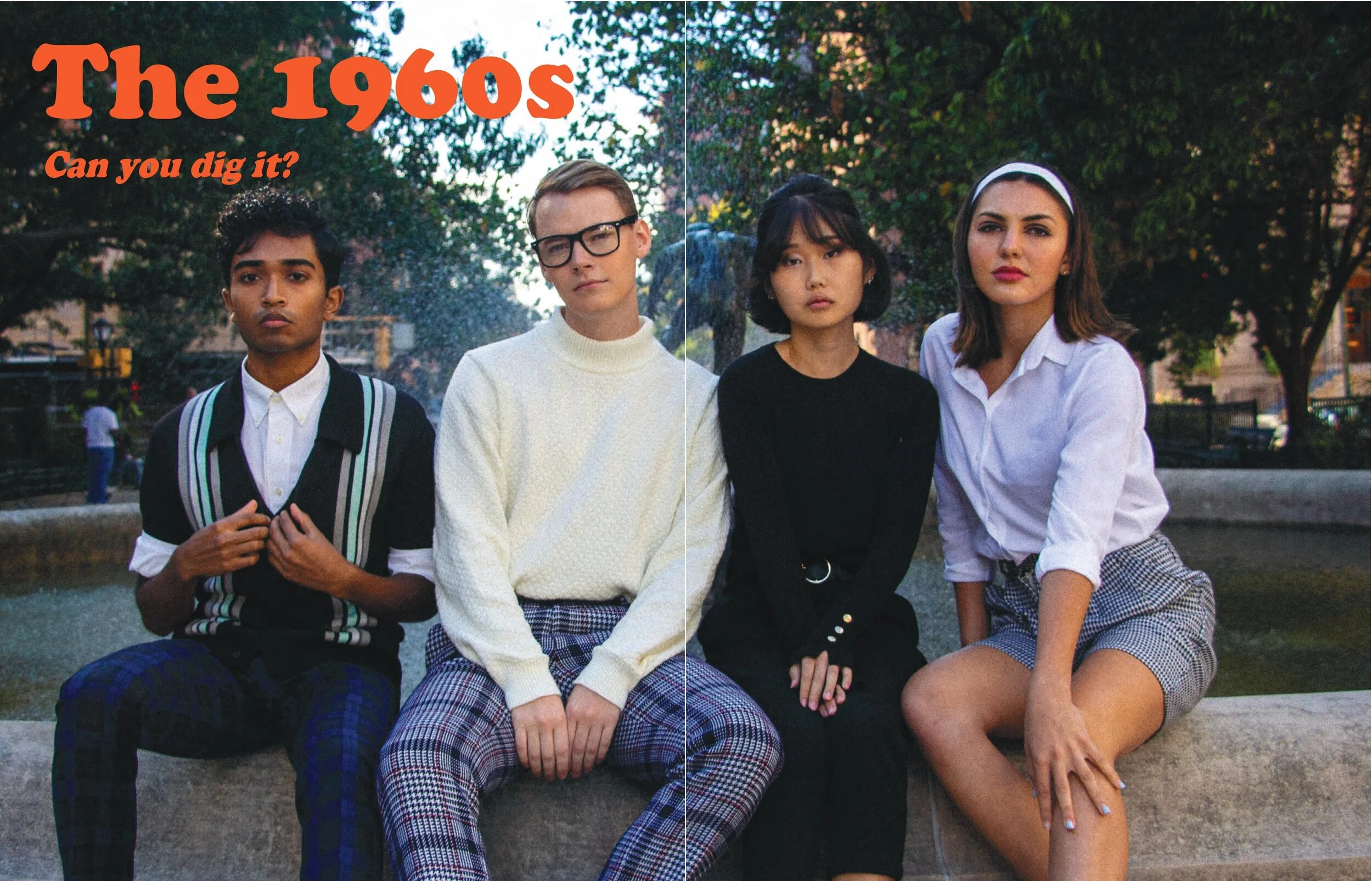
Marque Magazine
Fall 2019 Issue // 1960’s Spread

Role: Layout Designer
Skills: Typography, Visual Communication, Interdisciplinary Collaboration, Multimedia Design
Tools: Adobe Illustrator, Photoshop, Adobe XD

Adapting an Iconic Decade
The central challenge for my spread was the task of adapting a decade that was defined by the organic expression into a magazine made for a digital age. Essentially, the photography needed a platform to speak for itself, yet the page design needed to form a nuanced narrative.

Telling Our Story
Inspired by simple layout design from authentic 1960’s magazines, we adapted stylized typography that give the reader a sense that we ripped these pages from Life’s 1960’s catalog. The goal is to stitch together the editorial and photography into an elegant, well-paced look into 1960’s fashion and publication.
Design Process

Typography
In choose the typographic style for this spread, I needed to develop guidelines that would maintain the theme of free expression that defined the 60’s, while being elegant enough to let the photography be the focal point of the pages. I found a great balance of fonts for titles and body text that immerses the reader in a perfect 1960’s style.

Color & Tone
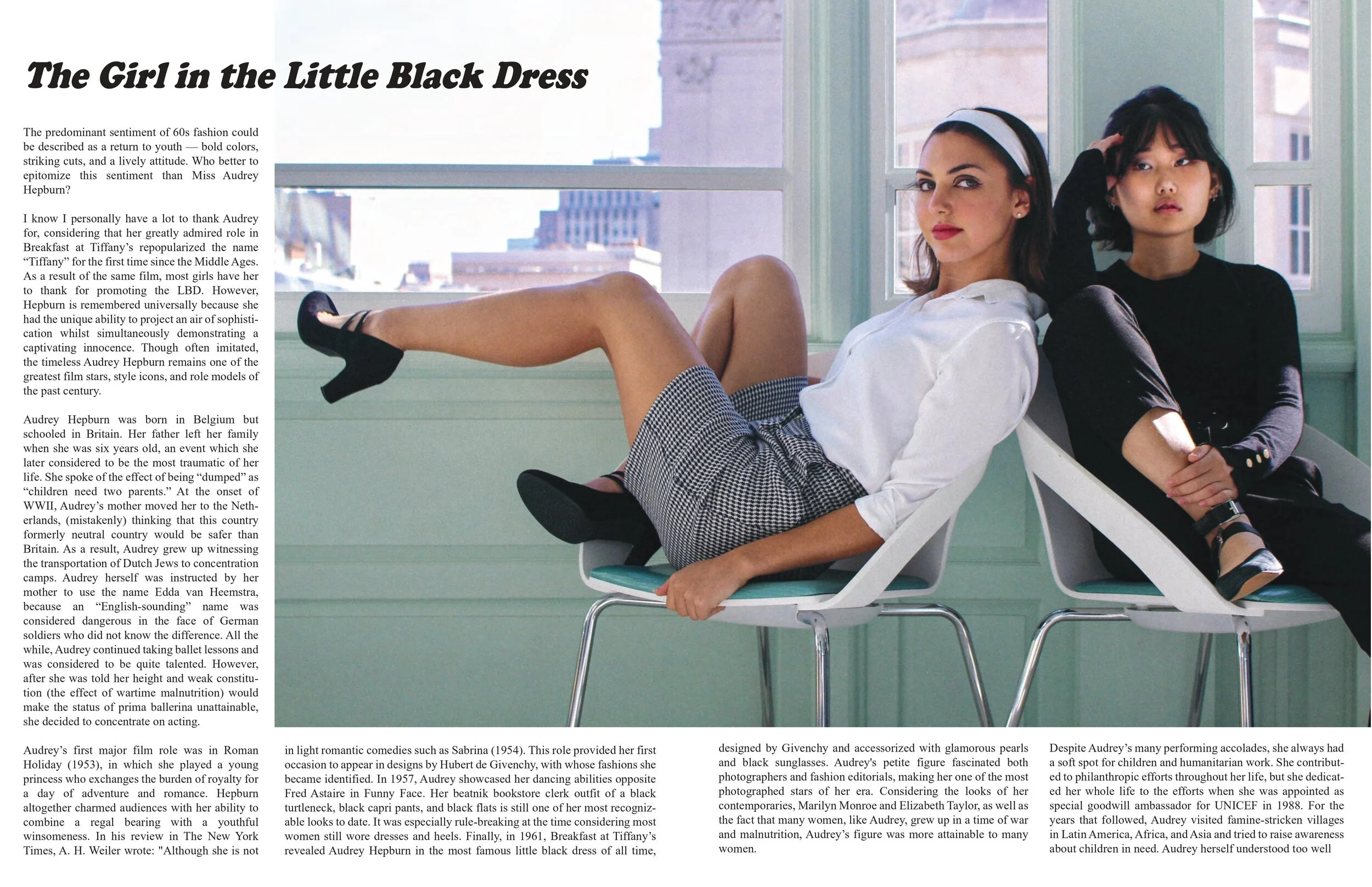
I analyzed the use of color in the magazines from the 1960’s to better capture the tone and perspective of the designers during that time. The most important idea in the color is to use more washed out, high value tones to create the illusion that you are looking back in time. With these colors, the pages allow the models’ skin to pop more, and allows the typography to stand out more.
Layout
To pull all the other aspects together, I sought out to design pages that felt immersive and dynamic. By guiding the reader’s eye across the editorial and photography, there is a better sense of immersion into the theme.